Hi Everyone,
I am delighted to report that I am almost done with the manuscript and visuals for my next book, Complete Guide to Bible Journaling: Creative Techniques to Express Your Faith. My friend and co-author, Regina Yoder, and I have been diligently working on the book for the past few months, and the closer we get to the finish line, the more excited I become. This has truly been a labor of love, and I wanted to give you a ‘sneak peak’ at what’s in the book.
Before telling you about the content, I wanted to share two of the many cover comps we’ve worked on. I don’t know which (if either) will ultimately be chosen, but I would love to know whether you prefer this design where you can see the entire Bible spread:
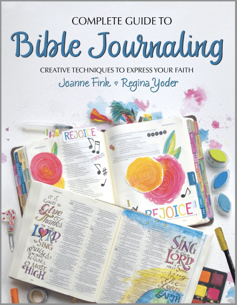
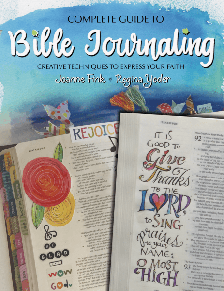
or the one below where you can only see the left side of the Bibles. I’d also like to know if you prefer the blue background with white lettering, or the white background with blue lettering.
As an incentive to share your thoughts, I will pick a name at random from all of those who leave a comment, and that person will win a copy of the book when it comes out. You’ll have to be patient though– it will be February or March before they will be available.
Writing this book has been a lot more involved than doing any of the Zenspirations® Create, Color, Pattern, Play books. With 128 pages, the new book is significantly longer, and it is divided into the following sections: Getting Started, Tools & Techniques, Artist Profiles, and Gallery plus a Bonus section. Here’s what will be in each:
GETTING STARTED: Pages 1-10. This is the introductory section, which covers the basics, including an explanation of Bible Journaling and it’s benefits, how to choose a Bible, and where to begin.
TOOLS & TECHNIQUES ‘HOW-TO’: Pages 11-45. This is the section that has taken the longest to write, and the one I’m most excited to share with you. It has double page spreads techniques which are widely used in Bible Journaling. Regina and I created the ‘step-outs’ for most of these technique pages, including acrylic paints, brush markers, stamp-pad painting, stencils, stickers, washy-tape embellishments, and watercolors. We are thrilled to include expert advice on Page Prep techniques by Rebekah R. Jones, Color Pencil techniques by Leitha Hunt, and Rubber Stamp techniques by Dorian Eng.
More than a third of this section is devoted to drawing and lettering techniques, and integrating them into an effective visual layout. I’ve crammed a LOT of great information into these pages: how to incorporate patterns into simple illustrations of flowers, birds and other nature icons; a spread on Dangles and Dangle houses; as well as several different lettering styles. Best of all I explain how to decide what lettering style and design motifs are appropriate to bring a quote to life, and show examples. I’ve been polishing this section all month, and am hoping that the book to be a valuable resource for anyone who wants to learn how to effectively combine lettering and illustration.
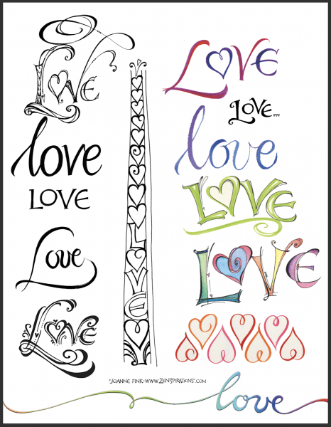
In the layout section I discuss how to use contrast to make a word or phrase stand out. I had wanted to include a page that showed a variety of ways to letter the same word, but in the end, didn’t have space for it. So I thought I’d share these LOVE variations with you, to whet your appetite for lettering styles until the book is published.
ARTIST PROFILES: Pages 46-91. This section has in-depth interviews with 11 of the world’s leading Bible Journaling artists, and includes photos of each artist in her studio, along with samples of her work.
GALLERY SECTION: Pages 92-111. This section starts by showcasing different artists’ rendition of the same scripture, followed by several spreads of work by artists, who like me, prefer to letter scripture ‘Outside the Bible’ rather than directly in their Bible. The bulk of this section is filled with inspiring images, grouped into different themes.
BONUS SECTION: Pages 112-128. The bonus section will be really cool, because it will include stickers, chapter tabs (like the ones on the bottom Bible in the cover photo) vellum overlays, traceable icons, coloring sheets and more. All designed to give new Bible Journaling artists a jumpstart on creatively expressing their faith.
Wow! Now that I’ve put this all in writing I’m even more excited! I can’t wait to hear your thoughts… about the cover and the contents… so please leave a comment letting me know what you think.
Before closing this week I wanted to thank those of you who let me know that the links to download the the designs I posted last week weren’t working… they are now fixed, so if you’d like to download the Breathe and/or Holding You in My Heart cards, you can find them on last week’s blog: https://zenspirations.com/blog/compassion-connection-community/.
I’d also like to congratulate Janice Layton, who was the winner of the ‘Think Pink’ blog comment contest from two weeks ago. Janice, please let me know what style you’d like me to letter your name in, and the name of the friend you’ll be sending your card to, so I can letter her name as well.
Stay Zenspired,
Joanne
Comments are closed.


I prefer the cover with the full bible spread and the blue lettering on white background. Can’t wait for this book to be available!
I prefer the top picture with the white background. It seems more… approachable.. when I can see the whole bible. Too bad this won’t be out for Christmas! I’d be buying at least 6! Great job Joanne! You inspire me all the time.
I like the one with the full Bible spread and the blue lettering.
I prefer the second one with only the sides…it comes across as more arty 🙂 i am so excited for this book. Will it be available in South Africa also? I love your work!
Prefer the second one with the side bars of journalling & the definitely the white writing on the blue background – just as it is in the second example. You can see that it’s a Bible for a start – the ‘tin’ says what is inside
& the blues in the journalling are echoed by the background above – there is interest in the whole design for there is a sense of depth in the whole cover whereas in the first it looks rather flat & just like another book – the second one would stop me as I walked past whereas the first would not.
I prefer the white lettering against the blue. Seems to stand out more. I also like the left page only as one can see the designs close up. Perhaps the 2 page spread can be inside. Will be a super book when finished.
I prefer the second version with just the left sides of the two Bibles showing. I also prefer the white lettering on the blue background. Aesthetically, this version allows the name more prominence and the artwork on the Bibles is not covering the words on the pages, which some people might have a problem with. It is not as busy and that makes it more powerful.
I prefer the second one with the blue background. What a great book and there are so many that will get allot out of this. Thanks for writing it! Can’t wait for it to be available .
I like both, but my preference is the white background with the full spread – it seems inviting and approachable. 🙂
Hi Joanne 🙂 .I prefer the first one because you can see that it is a book where you will need colors pens and color pads . Maybe not everyone nows what journaling art is .Bye
Dearest Friend, I do think the second illustration shows your creative examples in better arrangement. I wish you so much success, and will be purchasing for myself and daughter. Loud applause from me!
The dark blue captures my attention. It allows me to quickly asses the needed information, while displaying the beauty of the possibility that lies within its pages.
I prefer the blue background but both are outstanding, You do outstanding work!
I love them both but I think my eye draws more to the second version with the blue background and a closer shot of the left side. I can’t wait to see it! It sounds like you’ve packed a ton of great information into it!
Blue background wit white lettering is definitely the better choice and also the layout. It looks more professional. I will be on the lookout for it in South Africa, but I am sure we will have to wait even longer.
Yo elegiria la primera opcion, con el fondo blanco.
I like the full page and the blue background with white lettering. looking forward to this book!
The book will be amazing makes me sit down and read already!!! For the cover the blue background makes your pages stand out more so I’d go with that one!
Definitely Blue background/white writing! Can’t wait to see this work! My daughters and I love Bible journaling.
I prefer the top one because it seems more artsy and that speaks to me…how ever I like the white writing on the blue back ground as well. Either way it’s looks so wonderful I love your work!!!
Joanne. .I definitely prefer the second one with the blue background. It is more eye catching for me.
Much luck with book. .I know it will be a huge success!!
My preference is the second one with the half bible views. I like the up close image. I also like the blue background with the white letters. It catches my eye. Your book sounds like it will be a wonderful introduction to bible journaling. So many different topics are covered.
It’s not an easy choice – both are inviting. I think I prefer the top one as is, though. It shows more art materials, and makes it look like “I can do that!” White lettering on blue is pretty, but I prefer the blue on white. It has a cleaner look.
The 2nd version is very eye-catching and inviting. The white lettering on the watercolor blue background is beautiful. Showing the close up of the art journaling in your Bibles matches the focus of the book without showing all the art supplies (which could be intimidating). Can not wait to purchase this amazing work of yours, Joanne!!
I prefer the left sides because you can see it better. I also like the blue background.
I prefer the left side only and white lettering on blue background. It stands out more and draws me in. I’m so excited to see this next book!
So excited! This is going to be a wonderful book! My eye is drawn to the second version you posted.
You are putting a great deal of work into this book and so much information can’t wait till it’s available!
I prefer the full spread (top) version, for the layout. For the color I prefer the blue background. Looks like an incredible project.
I like blue!!
Wow, Joanne!! I can’t wait to see your book; it looks spectacular! It will be such a wonderful resource, not only for Bible journalists, but for artists in general.
I had a really hard time deciding which layout I liked best, I love them both! But I think the one on the bottom has more punch.
We have missed you on FB and I know everyone will be so happy to have you “back”! Sending love, prayers and lots of positive intention, as your deadline approaches!
Mary Anne
I like the white lettering on the blue. It looks like writing in heaven. Can’t wait for the book to change me out. Thanks for sharing your talents.
Love both of these, but prefer the white background with blue lettering because I see some of the art tools used as well as the wonderful pages! I’m so excited for this to come out because my sister would LOVE it, and I’m dying to apply it! Thank you for all of the hard work!
I love both,but the second version is my favorite….Love all your work so beautiful. you inspire me
I love the blue background.Everything you do is so beautiful and so inspirational Thank you for your beautiful work It is a blessing.
Both are interesting but my eye prefers the second one with only the left side showing as it makes it all more inviting…the first one seems a little cluttered to me as I tend to think less is better…
I prefer the blue background. I I think it is more eye catching. Congrats on your book.
While they are both lovely, I think I prefer the second one. The artwork is lovely and the blue banner on top catches the eye.
So happy for you that you have finished your new book. It sounds amazing. I like number one in white. It lets the reader really see what the full bible can look like.!
I prefer the white background with the blue lettering. Great Job!!
JoAnne once again you have created an amazing gift for so many. This is AH-SOME! So full of information. Can’t wait to get my hands on it!!! Both covers are very nice, it’s very hard to choose, and I don’t think you can go wrong with either. For me I am drawn to the first one with the full Bible pages shown. Once again, it looks like you have hit it out of the park!
My preference is the top picture with both sides because that way there’s no question about how it will look. As for color, I’d like to see a white background with blue lettering,simply because I like blue. I’m just not sure whether it would clash with the artists colorings/journaling.
I like the one with the blue background.
The top picture with the white background appeals to me. It make me want to reach for it.
I also think the one with the blue background is better because of the contrast. It snaps! Looks like a great book!
Hi Joanne! I prefer seeing the whole bible as in the first example, but I like the blue background better (really stands out!) I can’t speak to the content much as I don’t do bible journaling, but it sure sounds like you’ve included a ton of great information! And i love all the variations of the word love! Good luck getting it finished
So glad about this!!! Can’t wait to get this book.
I prefer the second one. It looks more professional and eye catching with the blue. I am amazed by the creative ideas you have over and over. You are blessed. Thank you for sharing.
Ida Mae
The white book cover with the full bible spread and blue lettering looks bright and fresh. It is very easy to see everything and we get a glimpse of what the possibilities are for our Bible Journaling! I LOVE this and I can’t wait for the book!
I like the full Bible spread as in the first photo but think the blue background with white letters should be incorporated into the first spread. That would be an amazing cover! Can’t wait to check out the book!
I love them both so much, but I’m more drawn to the second one with the blue background. the details seem to pop more for me on that one. I’m excited about this book and cant’ wait.
I like the top layout. It shows all the fun products you will teach about. The second layout would be good but could use a little tweaking. The two bibles are forming a dividing line across the page. Looks fantastic!
I like the blue one just the way it is.
This looks like a fabulous book! I prefer the blue background with white lettering, but would like both sides of the Bible pages to show. Thanks for your inspiration!
I like the blue covering since I like the color blue. However, was wondering how it would look with the full spread of the first (white background) as it shows some of the elements used in bible journaling. Excited about new book☺️
The blue background grabs your eye more than the white one. I am SO excited to see the final copy! Your artwork is amazingl! I know your Bible journaling book will become a treasure that I will use over and over for inspiration! Thanks for all your hard work that went into creating this labor of love!
Both designs are great but my preference is the left side of the Bibles only and the blue background with white lettering. The book will be fantastic!
I prefer the second one. It’s so colorful and inviting!! Thank you, Joanne and Regina, so much for sharing your beautiful talents with all of us! <3
I like the second selection with the blue background. The Bible spreads seem to pop off the page more. I will enjoy your new book
I prefer the second one-like the closeup views and the white lettering coming out of the blue.
I prefer the first one with the white background. Simplistic yet elegant while the second one with the blue background is too busy.
Hi Joanne! I like the first design since it shows some art supplies to open interest for Bible journaling using artwork. I am excited about your book coming!
They are both pretty, but I prefer the 2nd with the blue background. It is just more artsy and inviting to me. What a lovely project – I have wanted to get started in Bible journaling for some time, but just haven’t pulled the trigger. With this guide, and list of the right supplies, I am looking forward to doing just that! Thank you for your faithfulness!
Second, darker blue is my preference. Wish, wish, this was available before Christmas, would make the most perfect gift! Can’t wait for this!
At first glance the cover with the blue sucked me in. So, with that said, they say always go with your gut feeling. I didn’t analyze, but it caught my eye so I think that is what I’d take off the shelf and look at. You’ve packed a lot of great information in this book. In my eyes, it’s a WINNER. EXCITED TO HAVE IT COME OUT.
My favorite is the top layout with white background and full spread page views. Blessings upon the work of your hands.
I love the first version. Is s little far but give you more view that is not just color, you will add tags and not use just color pencil, you can ink and paint and you are allow to be messy. Thank you for your zenspirations and your love for art ithat help us to worship in a creative way.
I like them both, but I prefer the first one.
I prefer the 2nd one with the close up of the Bibles. It’s cleaner and shows the journaling more. I get what you’re trying to show in the 1st one with the stamps and things, but the other is more appealing to me.
Hi Joanne,
How exciting this looks like a wonderful book! As always I can’t wait till it’s available for purchase! Decisions, decisions I would have to say I really like The second choice better the blue background with the white lettering is very calming and something different than just plain lettering! There are tons of people on YouTube who are into Bible journaling, I think you will have a terrific customer base. I also like the Bibles in the second photo That are only showing the left side – this gives people and idea of what Bible journaling Is and they will be interested to open the book and see more! It sounds like this book is packed full of very useful information some I could even learn from! I wish you continued success with all that you do! Thank you for the opportunity to participate in this contest!
I have been a avid Bible Journaler and a follower of Joanne for a couple of years. Would love to win this book
I like the blue letters on the white background and the left side of the Bible pages. In other words, the top of the first one and the bottom of the second one.
I like the second one the best. To me, the first illustration is too intimidating for a beginner.
Seems to me the 2nd option; white lettering on blue background stands out more. The first is busy so the title doesn’t stand out as well.
I think the entire spread is the best design because it shows some of the tools individuals can use and is enticing to the potential artist in everyone! I do like the blue background with the white lettering as it “pops” the title; maybe a combination of the two? Both are beautiful! I’m looking forward to the book!
I’m so excited about this book, thank you and Regina Yoder for taking the time and effort to write it. I like both layouts for the cover but prefer the full Bibles with the white background and blue writing. Please keep us posted on the release date. Thank you for the sneak peak, love the way you did the page with Love. Can’t wait to read your book and learn more about Bible journalling.
Hi Joanne, I can hardly wait. I think the 2nd cover is my choice because It shows the finished work and gives my eye a place to rest. I know that whichever cover you choose will be the one that was meant to be. Regards Mary Ann Fields
Morning Joanne, I like both of them for different reasons…..the cover with white background and blue lettering shows me some of the tools I could use to add art to my bible pages and gets me excited. The cover with blue background and white lettering shows to different styles that really add to the Bible pages and would encourage me to check the book out further. The second is my favorite if the two.
Ok I like both from an artistic point of view too – but considering that I didn’t really understand what you meant by bible “journaling”, I would have had to see that you are journaling on an actual bible. The first cover would explain it to me. Journaling for me has been in a plain drawing or watercolour book. Maybe to many others too.
Truth is…..I would buy it anyway…..
My personal preference is the second version! The blue background with the white lettering is more eye appealing and I think it would stand out better on the book shelves for sale purposes. I like how it shows the artwork close up too. I think there is too much white in the first one…. white background and white pages from the Bible. It blends in together too much and maybe a little too busy looking too. I like things that are simplistic, especially for advertising purposes. Regardless of what you choose, I am anxious to get my copy. 🙂
So proud of you my friend! <3
I love them both but am drawn to the first one that shows the open Bible. I think it emphasizes what it can look like the best.
I can’t wait for this to become available!!!!
I prefer the first one!
First of all, you ladies have done a tremendous job on this wonderfully creative project. Personally, I prefer the full page layout, so that you can see how a whole page would look. I do like the white lettering on the blue background, as it seems to pop more.
I love them both and would be happy with either one. What a beautiful way to express your quiet time with the Lord.
Like the top one. I like the fonts used. I find it more readable and I think the colors are better. It’s inviting. I like seeing both pages with artistic designs along with the ‘paint brush and things at the top edge. Great job either way/ Happy to participate. Hope to win!
I prefer the blue with white lettering but both are absolutely inspiring! Can’t wait till they are out! :):):)
like the second one! Can’t wait!!!
Both pages lovely for different reasons. I think for those new or never having done bible journaling, the first one with more white in background showing full pages, gives you more ideas and that you can use the entire page. If you are just glancing at the abbreviated version, you might not grasp how the entire page can be worked. In the second one it’s not really clear that you can use the entire page. They are both beautiful!! This will be an awesome tool – even for those that do other kinds of journaling.
To me, the white with blue lettering looks more like a book cover; the one with the blue background is more informal and, to me, looks more like a chapter lead-in page. They are both beautiful, but I choose the white background. 🙂
I am very excited about your book! Thank you for writing it.
God bless you!
I prefer the white background…with the more traditional lettering, however the brightly colored pages would probably be more desirable to the younger generation…
Both are delightful, but I prefer the one with the blue background at the top. The art “pops” more and is more dominant. Either will draw your audience, though; of that, I’m sure! Congratulations!
I love the first one, white that shows more fully how the book will be used. It sounds wonderful to me. I have never tried journaling in a bible but I do love to art journal and am drawn to this new idea. Looking forward to seeing your wonderful book published.
I prefer the bottom picture, I like the blue background. It tends to draw my eye more.
What a great project! Can’t wait to see what the final book looks like. I prefer the second image for the cover with the blue background and white print.
I prefer the white background with the full page spread. This book sounds awesome! Can’t wait to see it.
I like the second one for the close up.
I prefer the top one but I son’t dislike the bottom one. They are really both very nice. I am so looking forward to the book. I have just started to Bible journal and need so much help..
Dear Joanne,
I prefer the first lay-out. It is somehow more all encompassing. However,, either of the lay-outs will be glorious. I would like to purchase a copy when it is published. Thank you for all the work that you did for the book. Hugs, Carla Tenreet
I love the second version with the writing & illustrations on the side only. Reminds me of the ancient illustrated bibles -fitting for the word of God-it would lead the eye in to read what is on the page and not be just a colouring book full of techniques. It would be truly a book to cherish and pass on as an air loom.
Good luck with this project.
You are an inspiration.
I prefer the full bible spread. White lettering on blue background. Love your ideas!!
Love the second one. Can’t wait!
Both are beautiful, but I prefer the second one. The dark blue is very striking and catches one’s eye.
Great job on the book. I am so excited to see it come out and will definitely be purchasing a copy for myself and a few friends.
At first glance I liked the second cover with the blue background but i looked again and agree i like the top one the best with the inks and such cause its more artsy. Can’t wait for it to come out. Even though i dont do bible journaling im sure i can learn some great art tips from the book!
As a newbie to the concept of Bible journaling, I think the top cover captures the essence of your guide better. When perusing a book shelf, I would easily be drawn to your book seeing all of the art material possibilities depicted on that cover (see what I did there? Drawn in… lol.) I like the white background with blue lettering but am wondering if a few more “smudges” could be added up near the title to give the appearance that the books are setting on a blank canvas of sorts. Maybe something similar to the pink splattering by Regina’s last name but on the other side up by the word, “Creative.”
I like the second version much more.
I like the entire spread with a blue background.
I prefer the spread with the left hand side only showing. Can’t wait to see the book.
I like both concepts and would love to see both incorporated in the book. If I had to pin it down to one or the other it would be bottom one with the designs along the edging. I prefer the lettering on the bottom cover because the blue behind the lettering looks like watercolor which is more artsy.
I prefer the second one I just love blut and it is not as busy looking as the first one It would make me think more about tbuying the book because it looks so much easier than the first
Now in my case I would buy the book just because it had your name on it. I love your work
I like the full pictures but I prefer the blue background. Those pictures pop off the page!
I prefer the white background with blue lettering. It is more inviting to see the whole Bible and it assumes more craft than the other one. Both are well done but, from what I know of the book, the first one does it more justice. Blessings. Leslie
I love the books. So Spiritual. I like the 2 full pages in blue writing.
Hi Joanne,
I’m so glad you are putting the final parts of the book together. I was on Amazon and saw its already available for pre-order!
The cover and layout both in the 2nd one, blue with white letters is more eye catching and appealing to me. The top one is too busy in the layout I think and the color doesn’t catch my eye.
Although I also like you would not write in my actual bible I look forward to the book for ideas to better express myself spirituality.
I’m not sure why my post came up anonymous. I’m surely not meaning to be!
((Hugs)) Toni P
The blue with white lettering. Easier to assertion what it’s all about.
close up with the blue background is great — love your work and dedication for this resource
This looks like a great book and resource. I prefer the double page spread with blue background and white lettering.
The 2nd one is more like the art in the book, so I would prefer it. Can’t wait for this to come out!
I am drawn more to the second one.
Hi Joanne I like both designs but if I had to pick one it would be the second one because it is not as cluttered or complex as the first one.
Your work is so delightful to the high and I’m a great admirer. Also , I love Timothy Botts’ work – in somewhat of a similar vein
High should read “eye”
Both are lovely; I prefer the first cover. To me it draws attention to the fact the book it loaded with inspiration to spread your wings and use a variety of medium journaling your Bible.
Yes, the blue lettering and the white background. Can’t wait for this book to come out, it looks and sounds wonderful!
Wow! The covers look amazing – sounds like it will be suchan awesome book!! While I do like both covers – and actually prefur the first cover – I have to say no 2 wins my vote. The blue creates a contrast that grabs my attention more!
Both covers are great. I seem drawn to the blue with white lettering.
You areally an inspiration to many and I’ve enjoyed several of your lettering classes. I can’t wait to add this book to my collection and see what wonderful goodies are in store for us. Thank you for sharing your knowledge and experience with so many. Congrats on the publication.
I definitely prefer the second one! To my eye the first one is too busy from a design standpoint and the second draws you in to want to explore what is inside the cover! Best wishes for a successful launch!
I prefer the second cover design. The full page spread seems too crammed with images and the second one cuts down on that while giving a better close up. The blue background also adds appeal where the white is “just there”. The second one seems more artful to me.
LOVE!!!!!!! I think the white background with blue lettering really POPS! I prefer the double spread.
I think the 2nd one is more visually appealing.
Wow…both covers are so beautiful! At first I would have gone with the white background/ full bible spread, but as I look at them more and more, I think I like the blue background. It seems “warmer” and friendly, and I just happen to love blue! But they are both beautifully done. I can’t say enough how excited I am for this book!
I prefer the first cover. Very engaging, drew me in to see more. Has a more modern approach. Happy!
The second cover with the blue seems to catch my eye quicker than the white one. You always have a flair for color in your art work, so that’s why I chose that one.
I really like the full pic of the Bibles with your tools and supplies scattered around them. Very fun and colorful and inviting! Can’t wait until the book comes out because it sounds wonderful and loaded with all kinds of fun goodies! Thank you both for the time and talent, and sharing them with us all!
Hugs!
Terri
I like the second one. The artwork in the Bible really stands out and you can see what you can accomplish. I feel this cover is one that would catch my interest in a bookstore on Amazon as a book that would inspire me to be creative with my Bible journaling. Also the blue background sets off the lettering for the title. But both look great. The first one is great for a title page but seems to be a bit more for the eye to take in when browsing through a book aisle.
Both covers are lovely, but I prefer the second one with the blue background and white lettering. I think it feels more approachable and less (potentially) overwhelming because the images are more focused and the overall cover art is less busy. Really looking forward to publication!
Both covers are beautiful, but the second one is more professional looking , more eye-catching and I think it draws you in more. It has more artistic life and creativity. Can’t wait to see it.
They are both awesome!!! I will definitely be adding this to my collection of Bible journaling supplies when it comes out (unless I win it)!!!! The top picture with the full Bible opened and surrounded by tools to work with just draws you in! Very inviting! Thanks!
Both covers are beautiful but Iprefer the top one with the white background, blue lettering and full page spread. I like that you can see how facing pages relate to each other. I also like that some of the needed supllies are shown in the background. I look forward to the book being published. Thank you for covering this inspiring topic.
My favorite is the white background. It’s a cleaner look and very engaging to me. Can’t wait to see the finished product!
I vote pic #2 on both issues. I like close up of the Bible. And i like blue background. Congrats on new book!
Love both but I thin the one with the blue lettering would be more eye-catching at a glance on a book rack. Too bad it has to be that way.
Not worried about winning…please just keep doing what you do so right! Love all things Joanne Fink.❤️#have bible ready!!!!!
I like both of them. Can you do both? Some pages do the left side of the Bible and then n some do the full layout. Just a thought. I’m sure someone else has had this idea as well.
Joanne, you are an amazing Artist/Arthur so what ever you come up with I know will be perfect! I cannot wait to buy a copy when it comes out!
<3
I prefer full bible spread and blue background.
I prefer the white cover with blue letters! Can’t wait to see the book!
know what I want for my birthday in March!! The Keep up your God-inspired work! the blue with white is my favorite eventhough both are eye catching!1
I like the second one with blue background, it catches my eyes and the illustrations are bigger. Maybe adding a photo of a hand holding coloring pencil or a brush (Sakura pens of course) will immediately tell that the illustrations are hand drawn.
I would prefer the first book cover, showing the craft supplies, but with the blue color element around the title,as in the second cover. The blue pops more, but the journaling supplies give more of a glimpse into the book’s content.
I prefer the first design, but I think the title would pop more, if the blue surrounded the title, as in the second book cover.
Joanne, I like the second cover page that comes across with focus and color that draws the eye. But I’d like it even more with the white background and blue lettering as shown in the first drawing. Awesome, totally awesome project!
I like the first one. I like that it shows entire pages which are bright and colorful. I’m very visual and the first one just caught my eye with all of the color and artwork. I also like that you show art supplies as it really adds to the visual concept of what the journal is. Also I think that your names stand out more on the first one but get slightly lost in the blue of the second one. Regardless of which cover is picked, I know it will be great!
I prefer the first one that shows the whole Bible pages. While I agree it’s not quite as artistic looking, I feel that it is better at showing the concept to folks like me that are just learning about Bible journaling.
Love all your work. I like the second layout. I can see more detail in it. Thank you for all your hard work.
Love both of these layouts, but my favorite is the second one. The white writing shows up better against the blue and the Bible portions are larger which makes them stand out more than the full-page photos. Looking forward to seeing and reading this book when it is published……Linda E.
I prefer full spread with blue background and white lettering.
My preference is the second one -I like the arrangement of the bible pages. I think the first one has too much to focus on. But I’d buy either one!
I’d prefer the second Layout, with the blue background, and only parts of the Bibles showing. I preordered the book some weeks ago 🙂
I prefer the second one — However, I will buy it whatever the cover looks like 🙂 I love your books and your art and look forward to seeing your ideas for Bible journaling.
I am SO VERY EXCITED about your project!!! I’m looking forward to continuing to learn from you and favorites like Rebekah Jones. As far as the vote goes, I prefer the first cover with the full layout, to me it emphasizes the fact that God’s Word is central.
I like the full page view, but with the blue background and white letter ing.
Actually, I like the full bible spread from choice #1 & the blue sky look behind the white lettering in choice #2 however, since that is not a real choice I would have to say #1.
I just think the full spread photo of the two bibles is beautiful and the other one looks, well, sort of “zoomed in” and “cut-off”. So even though I prefer the lettering on the second one, I would choose #1 because I think the look of the Bible photo is more important. Hope that helps and is not too much. I just love all that you do Joanne and I’m so very glad that you made it through the storm unscaved 🙂 Big Hugs!!
Reeah.
how exciting!! can’t wait to get one!! I would prefer the left side only and white background! Thanks
My preference is the one with the blue background and the white lettering. I like the close up look at the pages and it isn’t quite as busy.
My preference is the second one with the 2 page Bible layout. The top one is too cluttered for my taste. Can’t wait for the book to come out!
Its all so pretty.
I like the top white.
Can’t wait to get a copy
the second one!
Just to be different I like the second one with the blue background and white writing but with the image from the first one
Hi Joanne, I am really excited about your new book and will definitely buy a copy. The second version really spoke to me and drew me in. Best of luck whatever you decide. It’s going to be wonderful!
I prefer the first with the entire pages.
We are excited and looking forward to your book! Sounds wonderful.
I loved the 2nd one with the blue at the top…..really drew me into the design. I will definitely be buying your book when it comes out!