Hi Everyone,
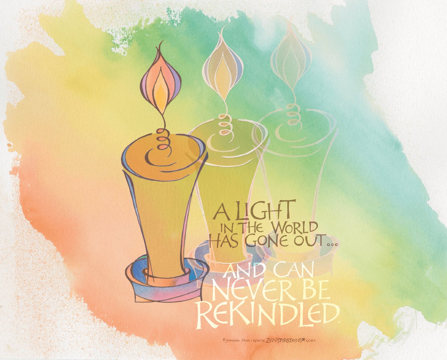
As many of you heard, master calligrapher and typographer Hermann Zapf, died this week at 96. Every calligrapher and typographer I know credits Zapf with having influenced the way they look at letter design. Although Professor Zapf was well into his nineties, his death has caused widespread sadness. He was truly incomparable, and the worldwide community of letter lovers mourns his loss while simultaneously celebrating his legacy. Though I had not seen him for many years, he was part of the foundation on which I built my craft, and I feel empty and unsettled knowing he is gone. I created the piece below, and am dedicating this week’s Zenspirations® blog to Hermann Zapf, with mingled grief and gratitude.
Since you can read about Zapf in Wikipedia or on the many design websites which have posted remembrances and eulogies this week (one of my favorites was written by Anne Quito, Design Reporter for Quartz (qz.com): http://qz.com/421855/hermann-zapf-the-font-designer-behind-palatino-and-zapf-dingbats-has-died-at-96/), I thought I’d share more personal reminisces.
When I was a young scribe, I was fortunate to have been accepted into one of the last ‘masters’ classes that Professor Zapf gave at Rochester Institute of Technology. That two week period had a significant impact not only on my lettering, but also on my outlook. It was 1985, and 25 students from all over North America eagerly gathered in the classroom awaiting the arrival of the great teacher we’d all heard so much about. 23 of the 25 travelled to Rochester with a portable slanted drawing board… but I was not one of them! I have always preferred to work on a surface with a slight (5 to 10 degree) tilt. This stems in part from the rainbow lettering I liked to do back then, and my discovery that I had better control of the way the colors blended if I worked on a relatively flat surface. But since I, like most of my classmates, had studied with British scribes, we were taught to use slanted boards to achieve the best possible writing. This was the first time that any of us had the chance to study with a German lettering designer and we had no idea what to expect.
Professor Zapf walked into class that first morning, and after introducing himself announced “I work flat.” Well, my heart soared! I felt vindicated! Someone else—and not just anyone else—one of the most respected lettering artists in the world—also preferred to work on a flat surface. The second day of class, out of deference to the Professor’s preference, not a single student brought their slant boards to class. But by the end of the week those students who were most comfortable working on a slanted surface went back to using their drawing boards, while the rest of us practiced letterforms on the flat desks provided. What I learned is that it’s important to do what works for you… If someone you respect suggests you do something a certain way, try it. But if after trying it you know in your heart that their method isn’t right for you, do what makes sense. After all, if HOW you are doing something isn’t right for you, it will probably show in WHAT you are doing.
When I give Zenspirations workshops I’m fond of telling my students that I since I invented Zenspirations, I can thereby give them permission to use the techniques they like, and to make up their own rules. Although my blog isn’t a workshop, in case you need it, I’m giving you permission to do the same. Have fun… experiment… take chances… try new things… we can’t grow as artists or human beings if we aren’t willing to change. One of the things I most admired about Professor Zapf was that he looked at the world differently from almost anyone else… he pioneered computerized typography because he had a vision and a dream… and the talent and dedication to make it happen.
Another bond that I shared with Professor Zapf was a love of the greeting card industry. Professor Zapf had a long-term relationship with Hallmark, and developed several fonts for their exclusive use. Hallmark even made a fascinating short film in 1967, The Art of Hermann Zapf, which you can see here: https://vimeo.com/5385464. It’s well worth the watch.
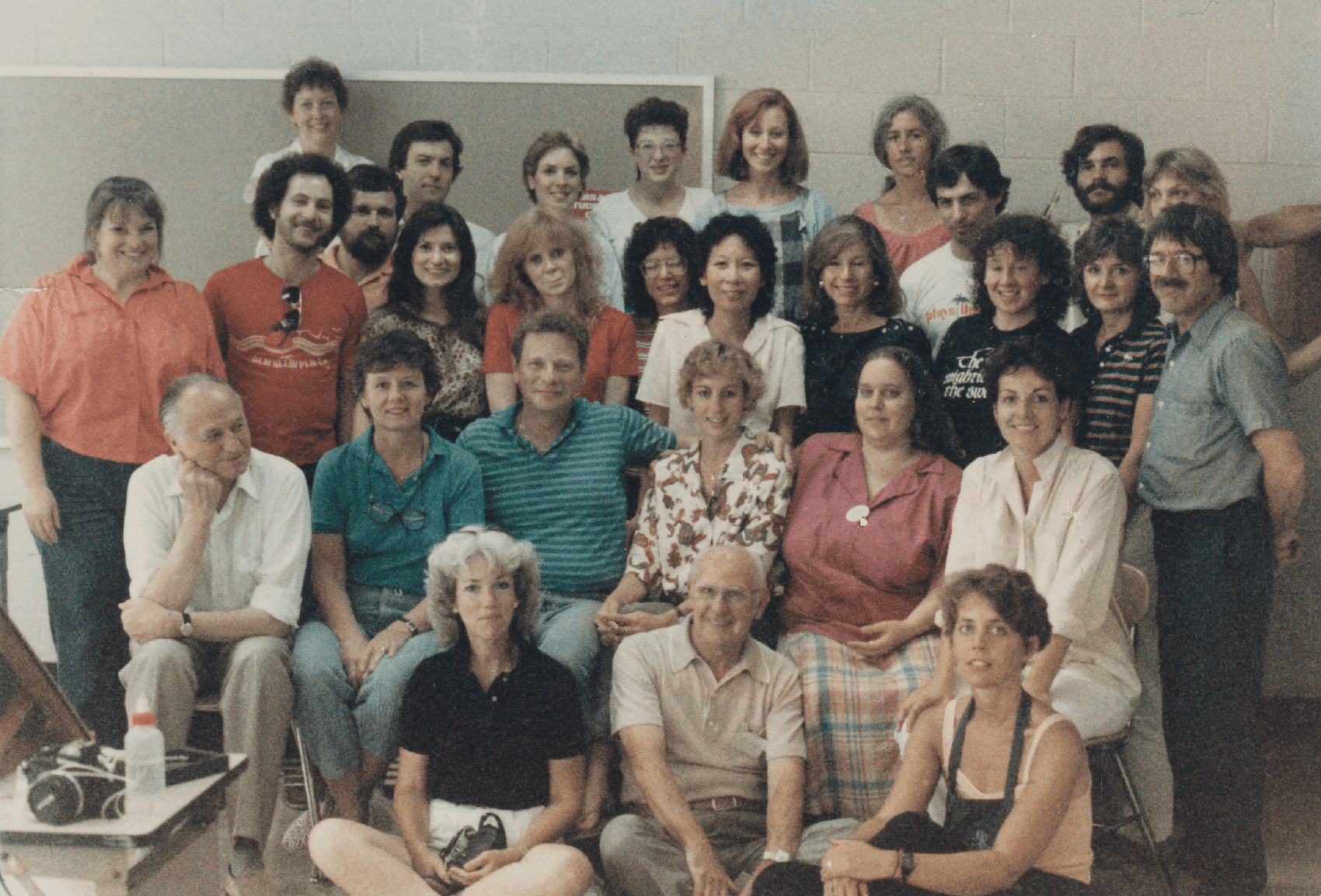
Below is a photo of our class, with Professor Zapf in the bottom left corner. Two of Professor Zapf’s best known students, Julian Waters (son of my awesome teacher Sheila Waters) and Jerry Kelly, were visiting that day and are in the photograph. Many of my classmates, including Barry Morentz, Eleanor Winters, Eliza Schulte Holliday, Sandy Schaadt, Sherrie Lovler, Karen Gorst, Jerry Tresser, Carole Maurer and Peter Fratedeus, are still active in the lettering world today.
Something else happened during the class which made a difference in my life… papermaker Joe Brown came in to our classroom and asked if anyone wanted to see how to make paper… needless to say, a bunch of us immediately headed down to his paper lab… where I fell in love with papermaking. I set up a papermaking studio when I got home, and spent years happily experimenting with different ways to ‘paint’ with pulp. I also went back to RIT for several summers to paper making with Professor Brown, which was a wonderful experience. It seemed fitting to tie that in to the tribute piece I wanted to create a piece in memory of Professor Zapf, so I raided the stack of papers that I made 30 years ago at RIT, and found one I liked.
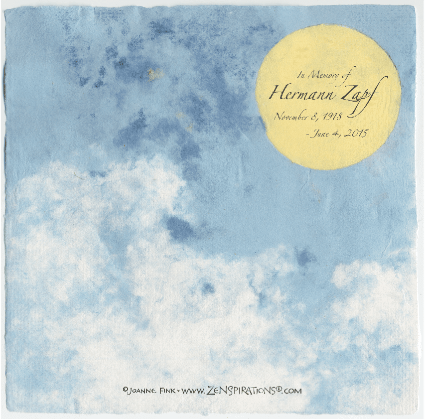
In his honor, I used one of Professor Zapf’s most popular fonts, Zapfino, for the lettering above… but to create the piece below, I hand-lettered the text, then scanned it and placed it on top of the hand-made paper in PhotoShop.

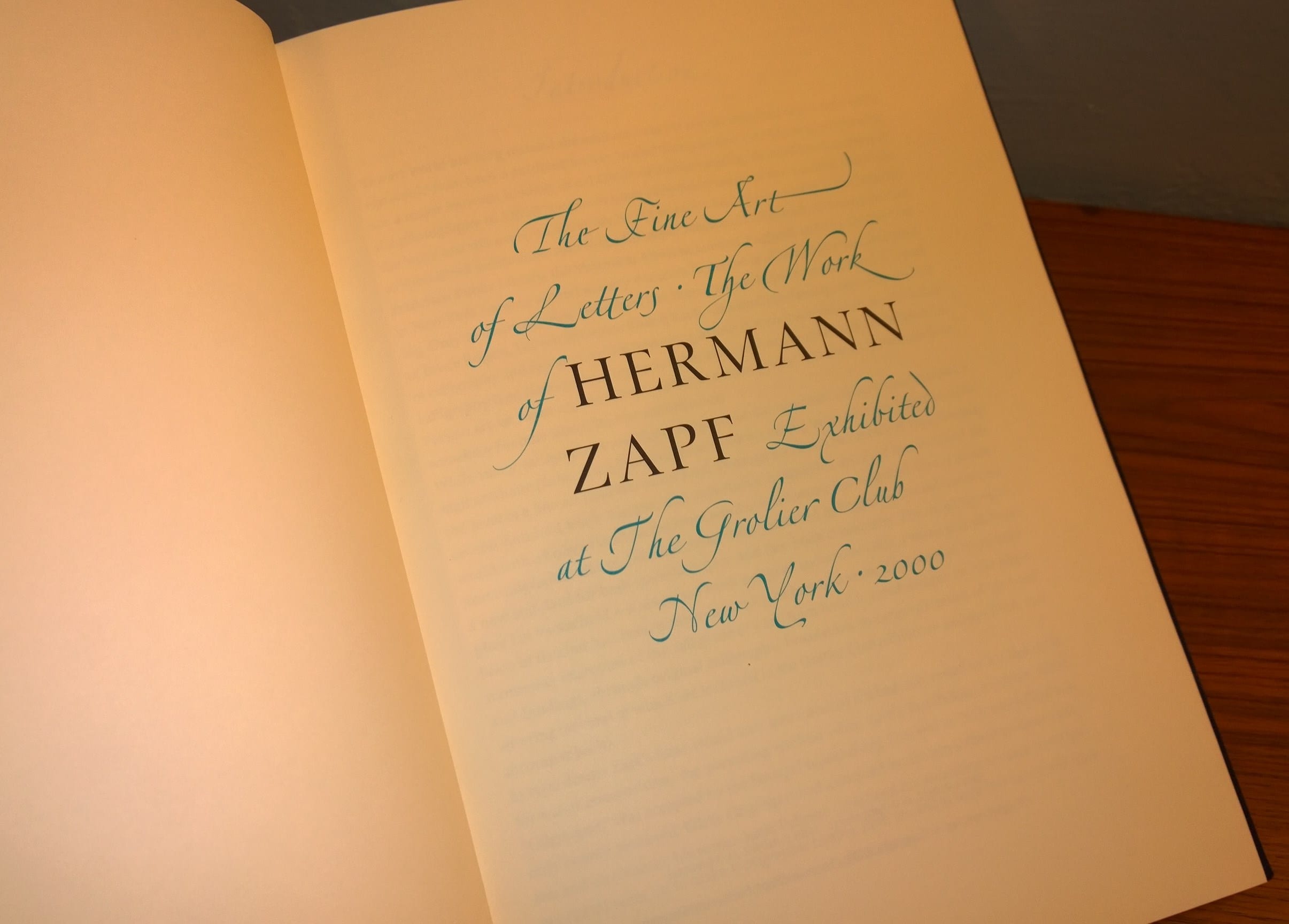
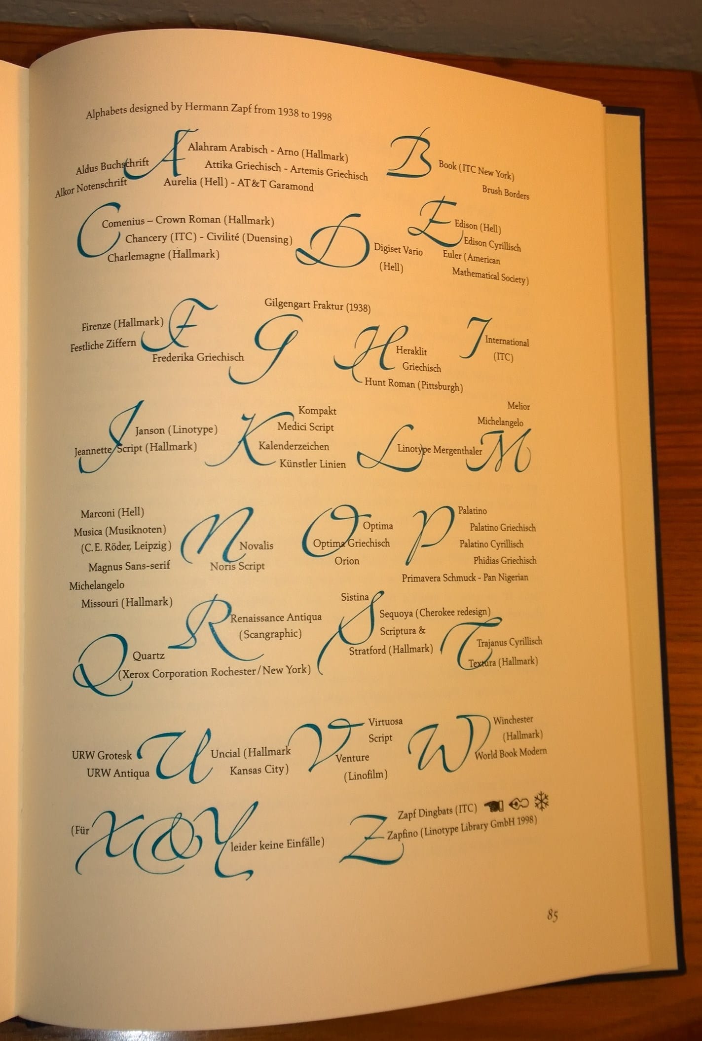
Professor Zapf was incredibly prolific. This is one of my favorite books of his work.
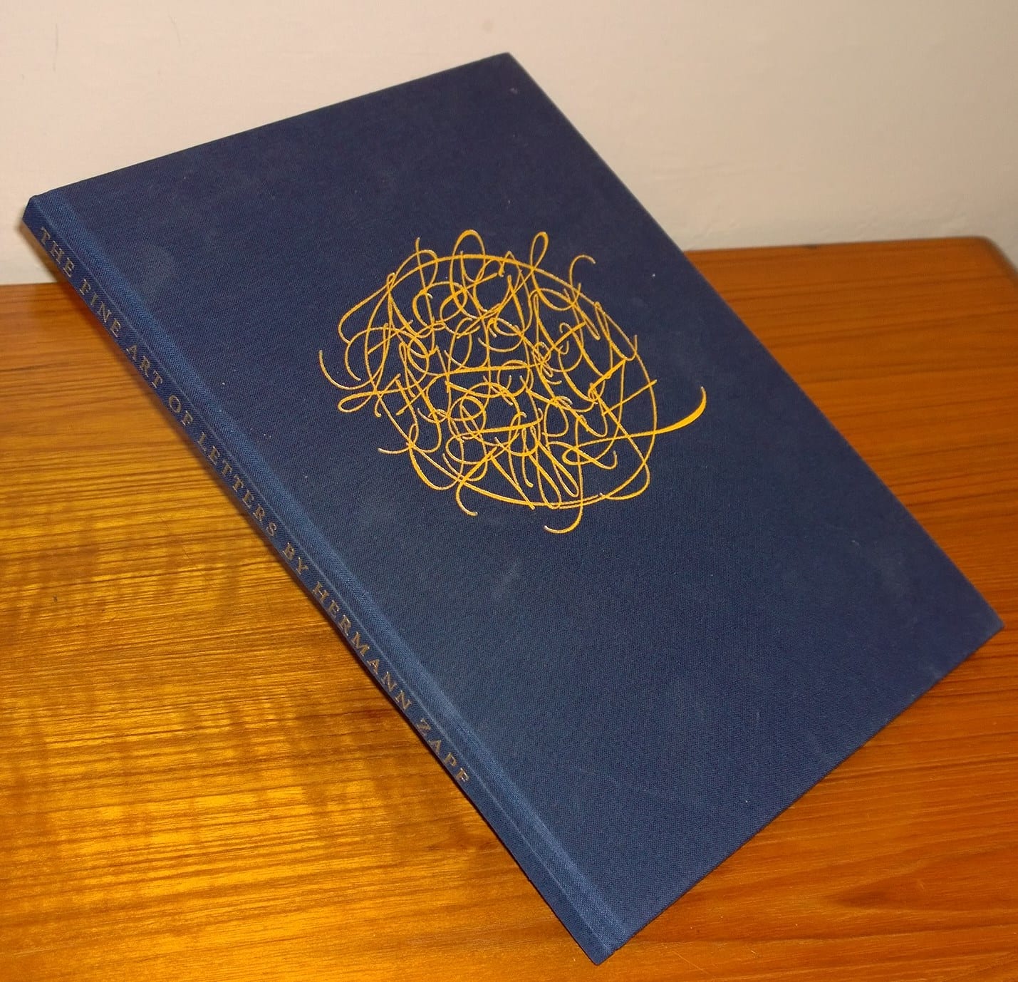
I wanted to share this page with you, because it lists all of the fonts he designed between 1938 and 1998.
If you have memories of Hermann Zapf, or would like to share how his work has influenced yours, please take a moment to leave a comment.
Farewell, Herr Professor… thank you for making a difference in my life… and for the difference you’ve made in the world. Your legacy will live on in hearts and letterforms of those whose lives you touched.
Stay Zenspired,
Joanne
Comments are closed.
What a beautiful and touching tribute. Your love, kindness and nurturing are welcome gifts. It is always uplifting to read your insights. The picture was also a treat – and how wonderful to start "back when" with so many that are still active and "flourishing" today. Thank you!!
Thank you for all this information and for your tribute to Herr Zapf. Not being a calligrapher, I had no idea about the depth of study of this fascinating topic. Looking at the photo of the type fonts he designed makes me appreciate the list of available type fonts on my computer all the more!!
Thanks so much for sharing! I enjoyed learning more about your background and the amazing influence of Herr Zapf.
Thank you for sharing this tribute to Hermann Zapf whose letter designs have influenced us all who may hand write or opt for one of his computer fonts. Joanne, you have been touched by one of histories greatest. LibbyG
Such a beautiful tribute. Thank you for sharing your personal experiences. Always love to learn more each and every day.
A wonderful tribute to a very special man!
Hi Joanne, what an amazing story, you must feel so blessed to have had Herman as part of your life, and that one of your other teachers was Sheila Waters. Know wonder you are so good at what you do, you have had the best to learn from, Thanks for sharing……….Kate