Hi Everyone,
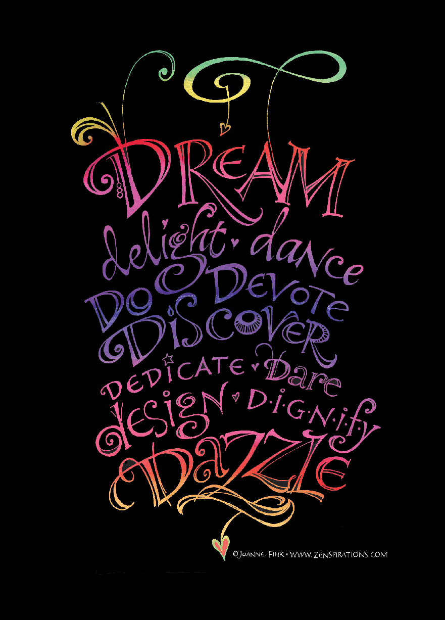
I love alliteration, and enjoy lettering uplifting and empowering words that all start with the same letter, like the ‘Dazzling Dreams’ design above. Using Sakura’s awesome Gelly Roll Moonlight pens, I started by hand-lettering as many inspiring ‘D’ words as I could think of. I did one verson on a black background, and another on a cream background to see which look I liked better.
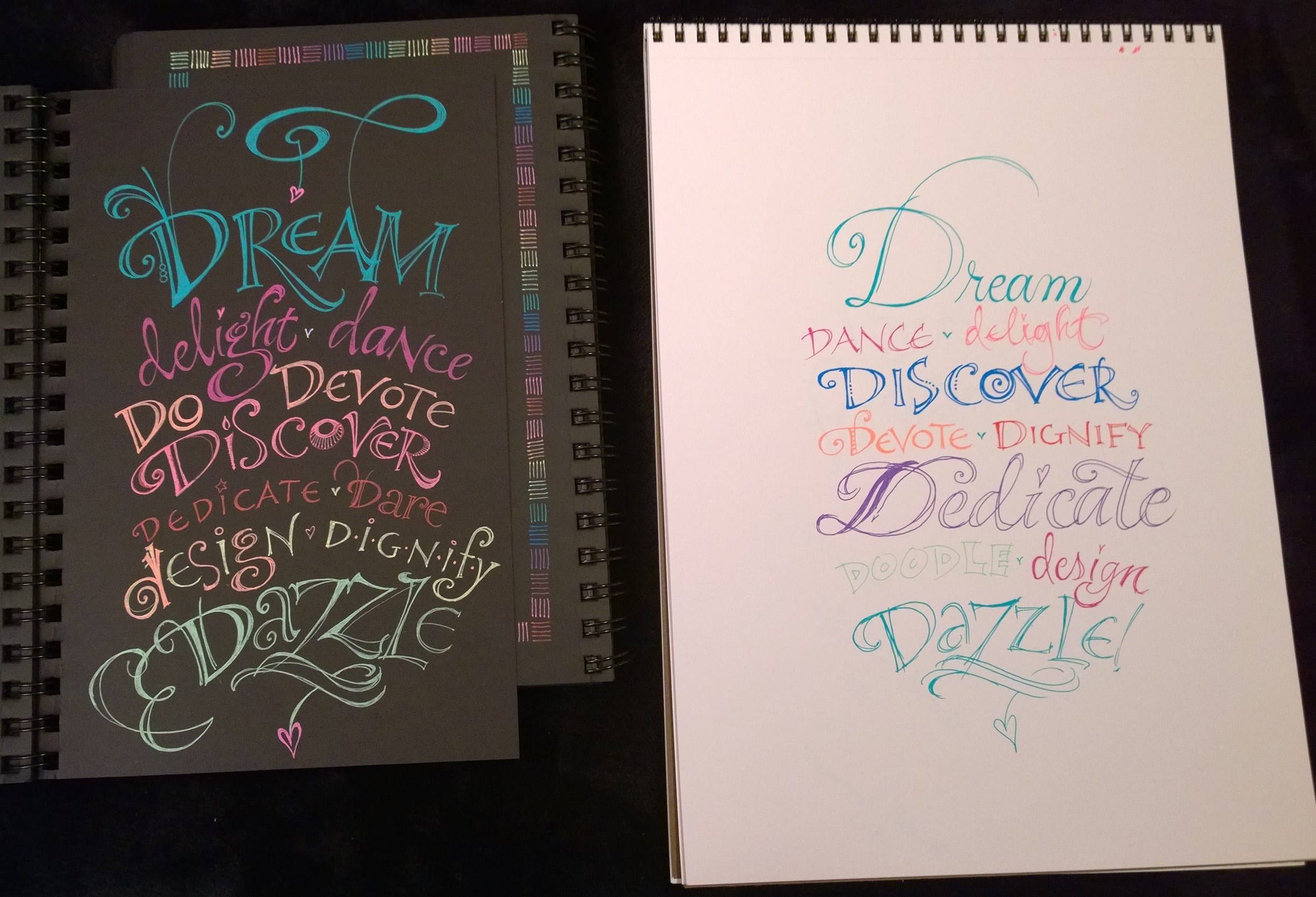
No contest! The black background was dynamic, dramatic and dazzling– so I decided to focus on it.
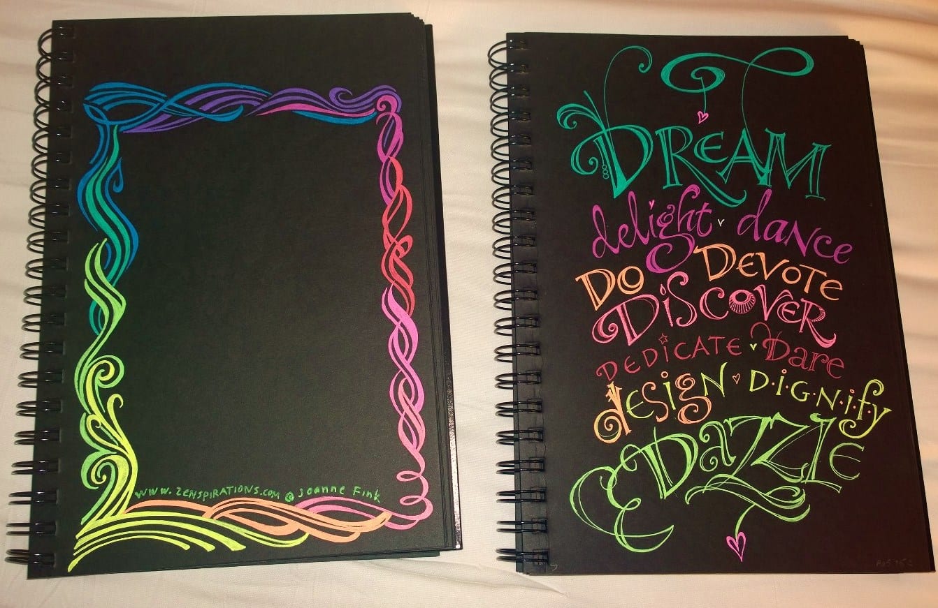
I thought it might be fun if the final design had a border, so next I drew a few different border options, and then scanned the lettering and borders so I’d be able to experiment digitally. I did some quick PhotoShop concepts to see which border looked best with the lettering, but am having trouble deciding… below are three variations:
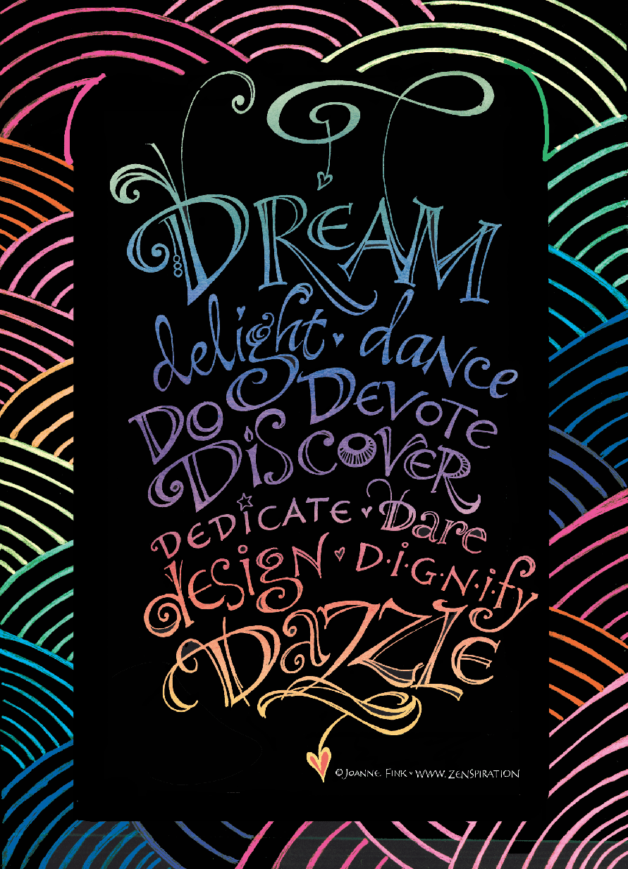
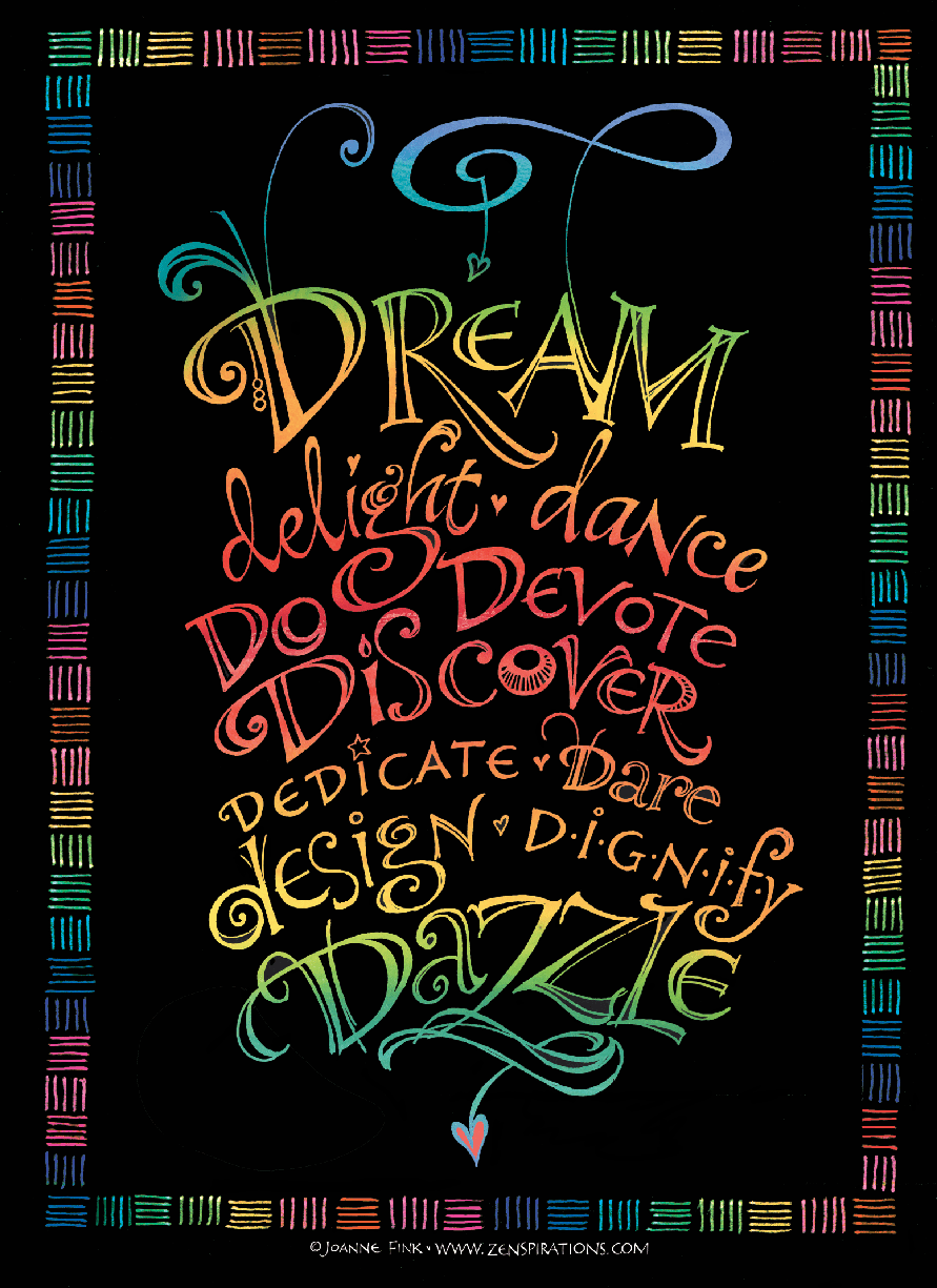
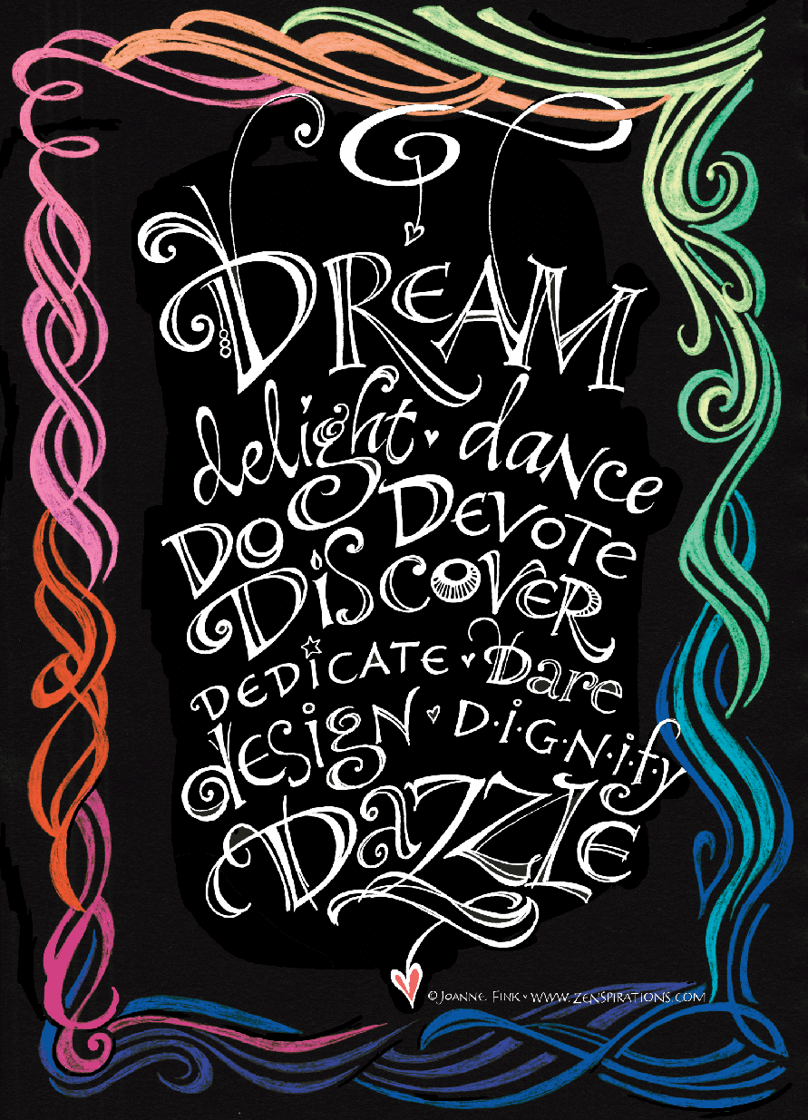
I’d love to know which is your favorite…
Stay Zenspired,
Joanne
Comments are closed.
I love them all Joanne!!! You were spot on with the black, and I feel the last border takes something away from the wording however the centre text is my fave as it is so intense!! I like the border on top too. I would love to see the centre image with a lighter border for contrast. hee hee. They are truly ALL fantastic though. Each is a winner. I'm pulling out my gelly rolls now! Thanks so much for sharing x
Hi Joanne, 🙂 It's a tough choice—they are all beautiful!! But I think my favorite is #2 with the cross-hatch border…it incorporates the color into the border without detracting from the awesome lettering and the color change throughout the lettering. BRAVO!
The middle one is my favourite – it frames the words beautifully – just enough so that the words have impact as well!
Hi Joanne, these are so beautiful, the second one is the winner for me, the text on the other two are great, but l think the boarders are to heavy, but isn't it so much fun just to create , even when our pieces might not always go together, so love your work, l have both your Zenspiration and the Dangles book, and now a big favour , can you do a calligraphy book, l would love to see your artwork and calligraphy together, everybody seems to focus on the beginners , and the basic watercolour backgrounds, or have you already got a book out . thanks ……….Kate
I love them all, but number 3 seems to catch my eye the most! I wish I was as talented as you are. Great job!
the middle one, hands down. LOVE it.
The lettering on the black is definitely fits the words more than the cream. I prefer the middle frame design. I like the first one, but when I scrolled down the second one really caught my eye. It compliments the lettering without distracting from it. The last one does distract from the lettering. Thank you for the inspiration. Going to find my Moonlight Gelly Roll pens . . . . .
Hi Joanne – I love them all. However the middle one is my favorite. The top one is lovely, but the wide border is a bit distracting – my eyes don't know where to focus. The last one is very nice too, but I think, IMHO the contrast between the white and color is distracting. The middle one is just right – the narrow border does not get in the way of the center message – it enhances it rather than overwhelming it. Ha! How is that for an opinion. Sorry. 🙂 Have a zenspiring day.
Love all of them! #2 is my favorite though! What type of black paper are you using? I need some to play on!
good morning! what a lovely thing to find first thing this morning–wow, color on black, especially for "dream" is so effective! I like best the one with the alternating straight lines border–it's a nice contrast to the curvy lettering. but then, I'm a straight-line kine of girl, so must take that into consideration! which is your favorite?? xox
I think that the middle one makes the text more prominent. They are ALL so beautiful and powerful. You are AWESOME!
My favourites in order are: 2, 1, 3. But they are all STUNNING!!! I love your art and am so happy that I happened upon it.
Thanks for sharing your beauty with us.
Kara
So beautiful Joanne! I love all three, but my eye is caught by the middle one, #2. Thank you so much for continually sharing with us. Have a dynamic day!
The middle one! You do such beautiful work!
IF I had to choose just 1 the playful scroll intertwined with the A wins my heart. Love your comment about "Empowering Words". Thank you for sharing your gift with us.
I love reading your blog posts and seeing your many wonderful creations. I think the center one with the dashed lines look best. Can you do a tutorial to teach how you do that color transitioning on lettering ??
Hi Joanne,
After travelling up and down the page for several passes, I think the first one beneath Dazzling Dreams gets my vote. I love the delicate blending of the colours, and the words need no adornment. Thank you
Sx
The first one, without a border
I like door #2 the best 😉
Love the varied colors on the black and in the printing, too. Tough to determine which I would choose as they each have big pluses! And, I like how you flourished the letters. I like #1 and #2 about the same yet all very nice. Always look forward to receiving your BLOG and reading what you write!
I like the swirly one ~ the third one!
Absolutely love all of them, but my favorite is really without the border… all the focus is on the words which are just so beautiful and encouraging! Thanks for sharing your gifts and talents!
The center one, it does not take away from your calligraphy and words.