Hi Everyone,
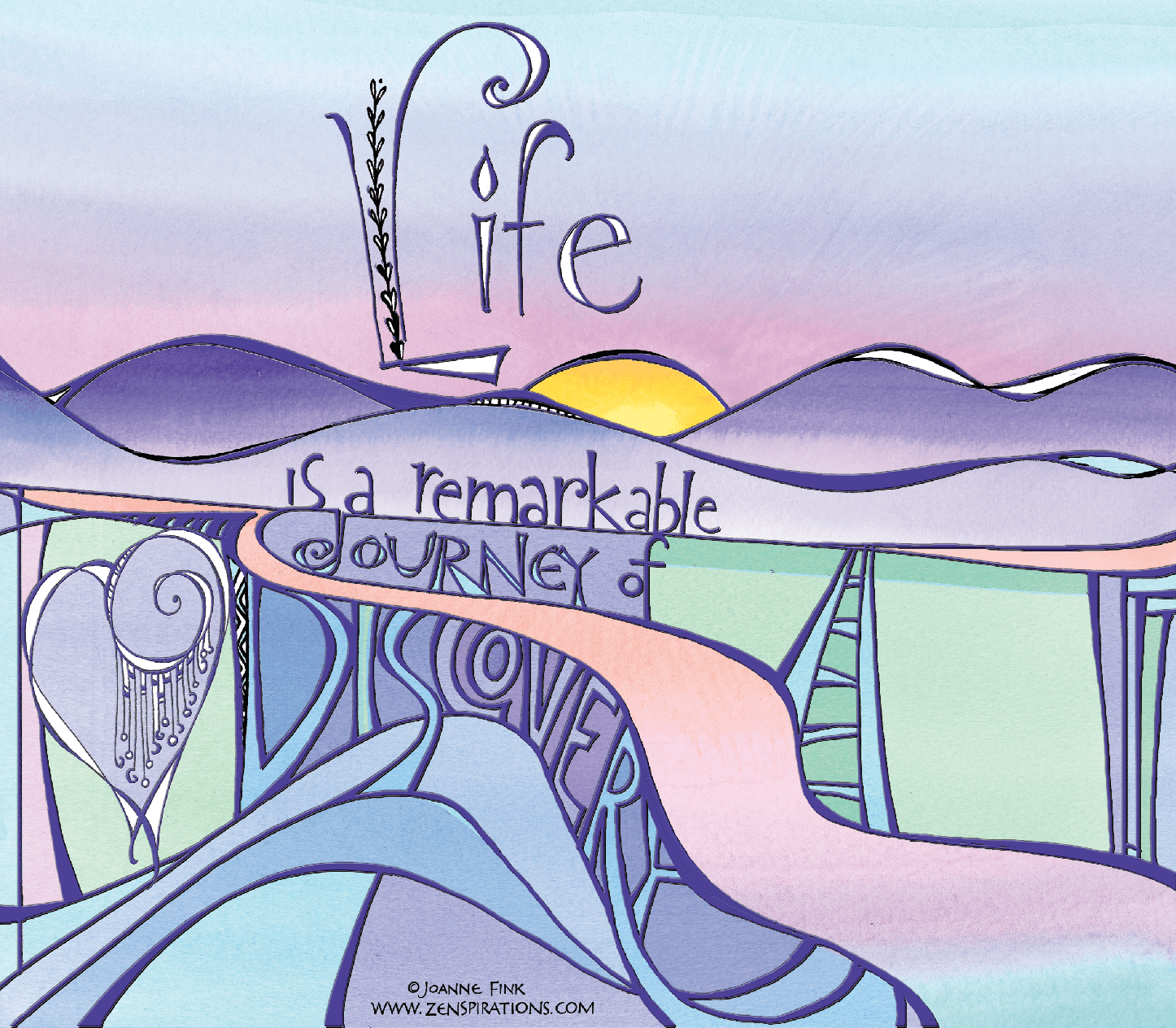
For the past few months I’ve been wanting to do a Zenspirations about what makes our life’s journey worthwhile. For me, the answer is LOVE… I am blessed because I truly love what I do and get to share what I love with all of you.
So here is the piece I’ve been working on:
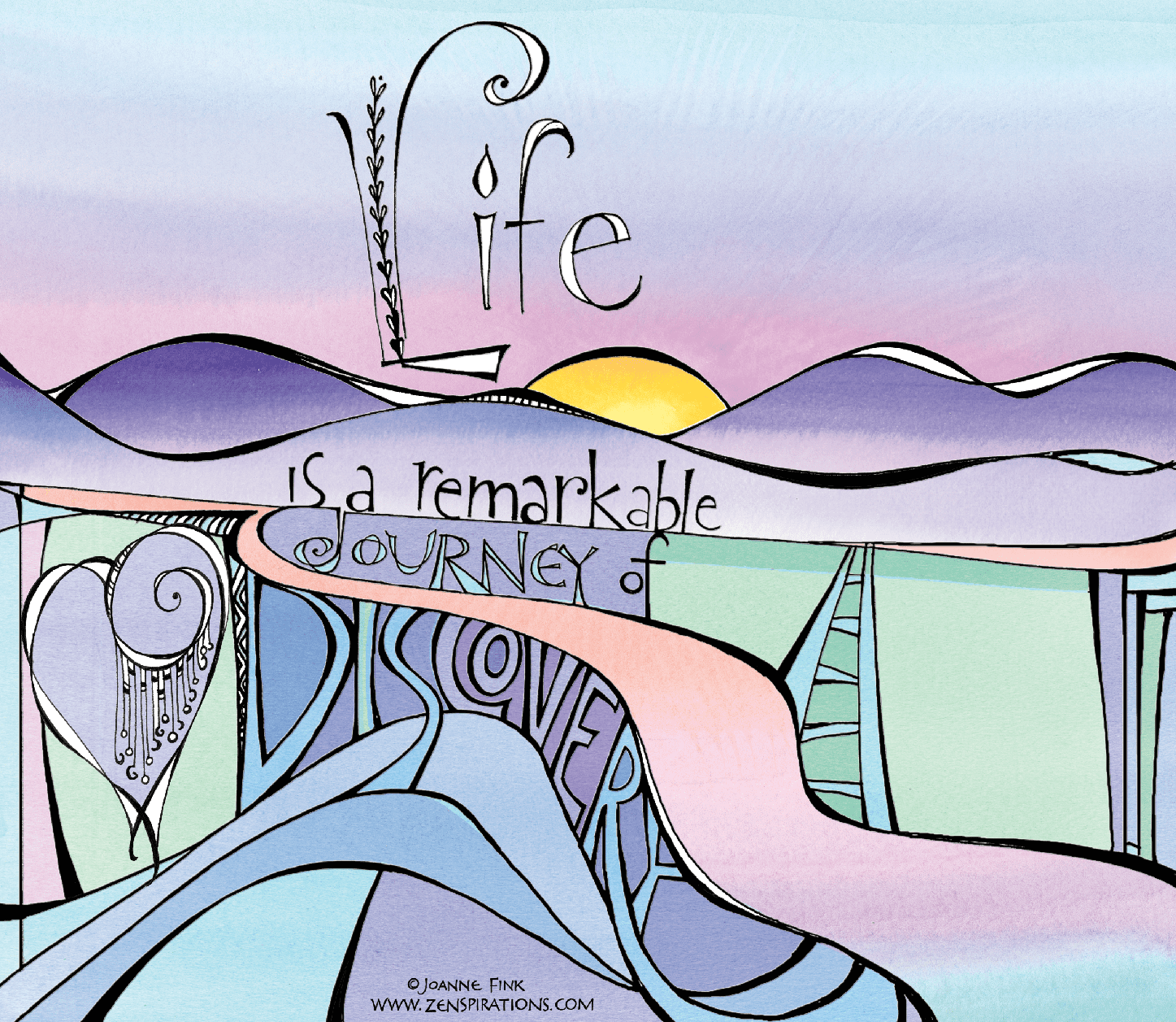
As many of you know, I draw most of my Zenspirations with a Pigma Micron 01, then scan the design and clean it up in PhotoShop. For the color, I usually print it out and add watercolors by hand; other times, like I did on this piece, I take watercolor washes that I’ve already scanned, and add the color digitally. Most of the time I keep black outlines on my work, but I thought I’d see what a purple version looks like… and now I can’t decide which one I like better.
If you have a moment, I’d really appreciate your leaving a comment to let me know which version you like best. I’d also like to know if you can see the word LOVE easily, or if you think I should make it more noticeable.
I look forward to your thoughts… and to continuing to share this Zenspirations journey with you.
Stay Zenspired,
Joanne
Comments are closed.


The black lines make the piece pop. The word LOVE is visible, but not sure if readers who are not involved with letters will get it.
I also think the black lines make it stand out more but have to confess I hadn't even noticed the word LOVE until you mentioned it .
Liking the black lines and the way the word "discovery" acts like highway supports on life's journey.
I definitely prefer the first one – although ALL of your work is stunning. I almost typed that I couldn't find the word LOVE, but then I found it…guess I'm not observant enough!
joanne, your piece is truly inspirational. I too think the black lines give more depth, but the soft pastel lines are soothing too! apologies too, as I cannot find the word 'love' I can see the l 'o' is the heart but then I am lost. please help. I am a novice tangler as just having taken first class a few weeks back at Fairbanks summer arts festival!
I think both work; however, I do like the top one with the black lines best. Wonderful way to sneak in the word LOVE ~ perfect!
Joanne,
Beautiful work. I like the top version better. Love could pop a little more (always, right?).
I like them both, can't decide between them, but I can't find the word love in it, even with the hints from the other comments, I did find the L and maybe the O, but even with that I can't find it.
Beautiful work, I love it!
I love the purple – it's a bit softer than the black which I usually prefer. But I can't find the LOVE – in either (unless the L is on the far left with the heart being the O in the L and the D doubling as the V…but where's the E?) I wonder what it would look like in black with LOVE in purple? (or vice versa?)
I like the black much better, but find that the purple is growing on me! The "love" certainly does not jump out at me.
Is it the middle part of "discovery", with the C looking like an "L"?? If not, I am stumped. Lovely piece. Trix
Joanne, I am such a fan of yours!!! I find your generous heart so inspiring!!!! However, for the Life of me, I cannot find the word "love" in either drawing… I personally LOVE the black ink. It is just so YOU 🙂
If you are going for a softer look, I think the use of purple is justified.
On a side note, I find your personal reflections just as inspiring as your art. So thanks for that!
Had to read through the posts to find "Love". The black one pops more, purple is one of my favorite colors but it is just a little too washed out. I love your pieces!
I think it is cool how we have to "discover" the word love! Sometimes it is not always in the usual place…..but it is there if we open our eyes. I will admit, I probably would not have noticed it if you had not mentioned. I like the second one better – it has more "life" and intensity, grabs your attention more. First one more soothing, peaceful. Love the piece AND the message – thank you for the reminder!
The drawing in black is much better in my eyes. I can only read lov and I am a calligrapher. Have I failed?Love your work. Carla
I like both. Each one has its place. Purple is softer. Depends what it is for. I love your art work. Love is hidden from me, but I will keep looking!!
I love both of them but I think the black makes the page "pop" more. As for "love" I don't see it at all. Maybe it's off the page I am looking for but I just don't see it.
Joanne, I love your work! I prefer the first example with the black outline. It just makes the piece pop. I like how you can see the word love and lover! Very creative.
I must confess, I do enjoy the more subtle purple outline. It lends a calmer feel to this piece. Not sure that it would work on everything but again in this case I prefer it. Love however was impossible for me to find until someone else pointed it out. As always, your work is inspiring and beautiful, your ability amazes me.
Look forward to each of your pieces….however, I am puzzled….first I could not find the word LOVE and I received only one rendition…but enjoyed that very much!!!! Thank you for sharing your talent
I am a total novice only having discovered zenspirations just recently. That being said, I like the black outline better. I can only guess at the "L" and "O" of the word "Love", but that's only a guess, then I can't find the "V" or the "E".
I am loving this new (to me) art. It is so inspiring and so are your lettering videos. I sure it's safe to say, I'm hooked on this.
Thank you for sharing your talent with us.
I like the black outlines best, and the sentiment is so true. Must admit, though, that I can only see the L and O of the word LOVE…That said, I'm inspired by your work and 'LOVE' viewing your videos :). Your enthusiasm just shines through each one.
The black one has the "pop". I see the purple one in a female's bedroom or bathroom. I think a version using both black AND purple would be appealing. If the LOVE isn't in "dislovery", then I'm as clueless as others seem to be. Your work is wonderful.