Hi Everyone,
After more than 30 years as a greeting card designer, I still get a thrill out of getting new card samples. So naturally I was delighted to get a box from Design Design this week, filled with some of the cards I worked on last year. Here’s a photo of some of the new designs:
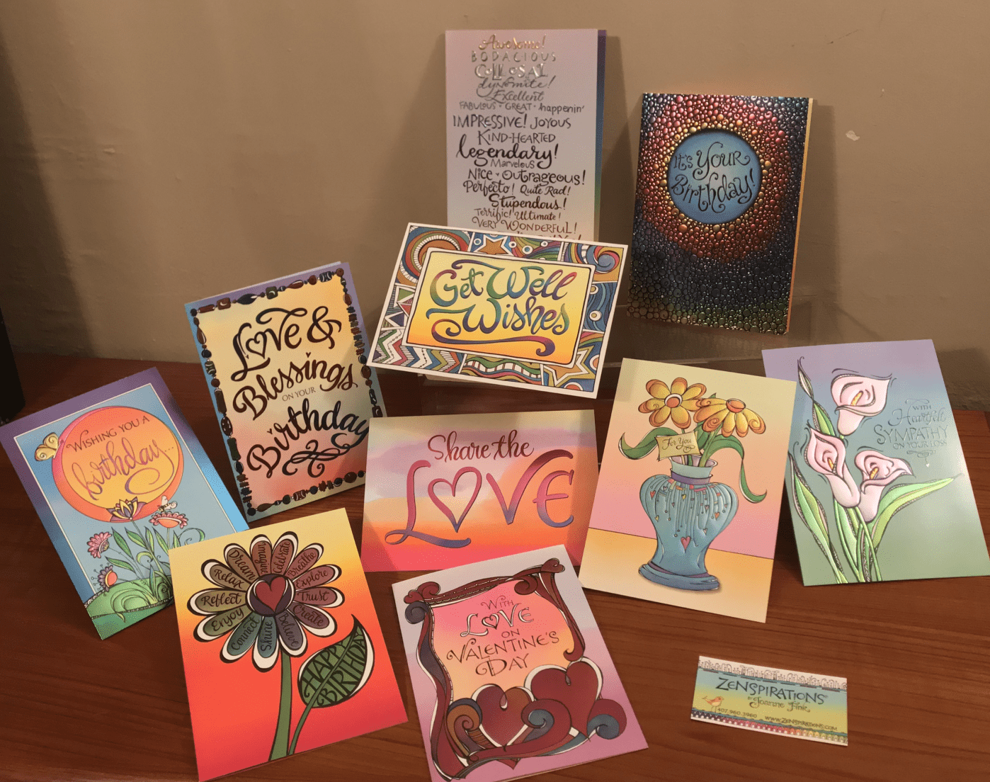
These cards are all done in the ‘Rainbow foil’ technique, and I love the way the foil shimmers when you move the cards so they catch the light. Here are close-ups of a few of the cards.
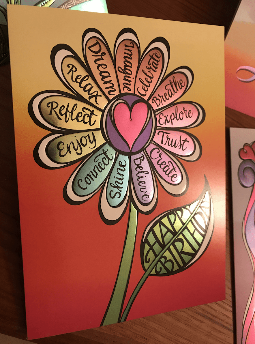
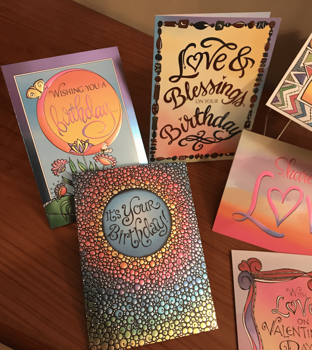
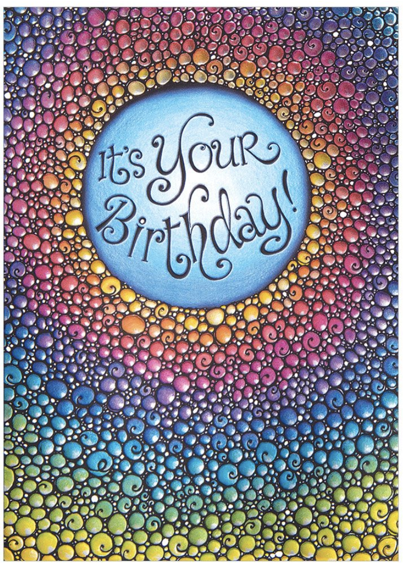
The ‘It’s Your Birthday’ card is really special to me, because it’s the first rainbow foil card I’ve done in collaboration with another artist. Last year, I asked my friend, color & creativity enthusiast Leitha Hunt, who’s exquisite colored pencil work always inspires me, to write about color pencil techniques for the Complete Guide to Bible Journaling: Creative Techniques to Express Your Faith (this is a link to Amazon which currently has the book on sale for $12.34!). I was working on this line of cards at the same time, and asked Leitha if she would be interested in coloring this design. I really love how it turned out:
To help celebrate the new cards Design Design is offering the Zenspirations® Community a 30% discount between now and the end of February.Most of the cards retail for $3.95. Click here to see the 50+ Zenspirations greeting cards, and use the code ZENSPIRATIONSSALE when you check out.
Before closing tonight, I wanted to share a design I’m working on. It’s one of my favorite passages from Genesis; Surely God was in this place and I did not know. My friend Beth Schafer is doing a Kickstarter to raise funds to record her next album, Renewed, and will be using this design as one of the rewards. Of the four variations below, which is your favorite?
VARIATION 1: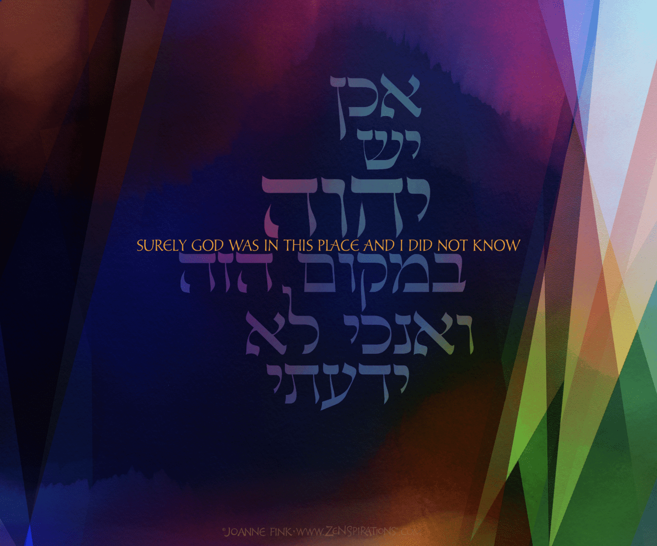
VARIATION 2: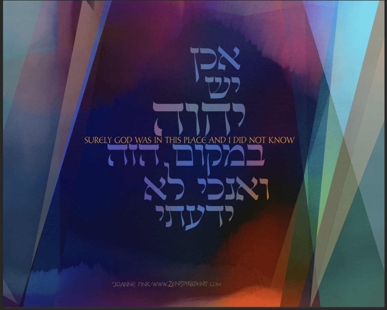
VARIATION 3: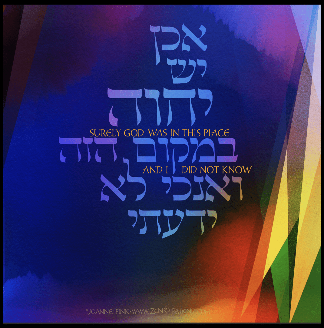
VARIATION 4: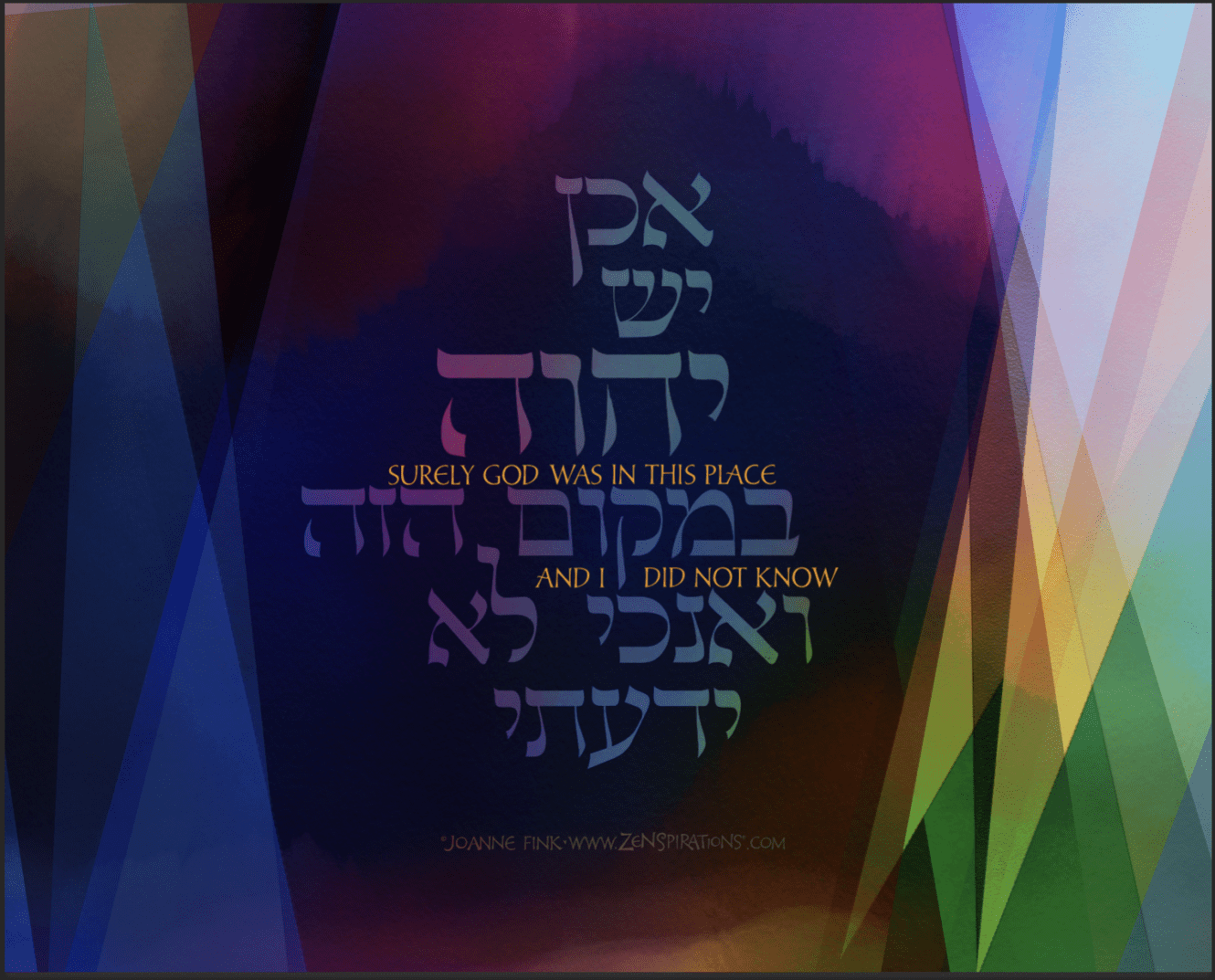
As an incentive to share your thoughts, I’ll pick one name at random from those who leave a comment on this week’s blog, and send you your choice of this print, or a few greeting cards from the new collection.
Before closing this week, I wanted to remind you to post your love-themed Bible journaling designs in the Bible Journaling Jumpstart FB group by midnight on the 18th. See last week’s blog, Bible Journaling Jumpstart, for details.
Stay Zenspired,
Joanne
Comments are closed.
Love the foiled cards, the bubbles one is amazing. Wonder if your creative stuff will ever be freely available in UK. I prefer Variation 3 in the lettering. The two of you have completed an exceptional lettering design.
Just a thought about this webpage, could the font colour in the Comments be made black? I can hardly read what I write!
Where all are probably gorgeous in person, #3 comes across the best here! Your Design Design cards are coming across beautifully !!! AMAZING
Joanne, these cards are Beautiful! So glad I got to meet you, hear your story and found out about Zenspirations at the Modern Widows Club Widows Empowerment Weekend. You have inspired me and brought back my creativity I once had before he passed away. Coloring your designs is so therapeutic on those “bad” days when I just need to get away from it all! Thank you!
Version one and WHAT BEAUTIFUL CARDS!
I like variation 3. The bright colors and bigger Hebrew lettering.
Good morning Joanne. The new set of cards are wonderful. I like print #3 the best.
Stunning as always. I like all four colour ways however my favourite is #3 wth the rich colours of fire and flame reminiscent of the pillar of fire that guided the Israelites in the Wilderness. Surely, even in the midst of chaos and lost direction the LORD is present.
I like number 3 the best it stands out to me more when I read it. I love the colors
I love the coloration and the brightness of Variation #3
VARIATION 3 is my favorite. I like the separation of the text and the vibrant colors.
It’s the 3rd variation that just glows for me.
I would choose variation 2. Just like the way the lighter tones are balanced on both sides. Second choice is #3.
How did you write the Hebrew? Is it part of the program you have on the iPad? How would I get started? Thanks and Happy Valentine’s Day
Hi!
I really like variation 3 because it is the brightest. I’m not sure what her thoughts are, but I think that celebrating where God is should be bright and the other variations seem to be less celebratory to me. Just my thoughts.
Thanks for all you do!
Melinda
You are simply amazing . And these cards are delightful. Wish you would make them available at WalMart.
I prefer variation #3 based on the way they display on my device. It’s a bit brighter. What a lovely quote.
I prefer Variation 3. The golden text split on the two lines makes the message more dynamic. The brighter color values on the lower left enhance the golden text. Beautiful card!
The entire card collection is excellent! Great job, Joanne!
I like #3. It’s brighter & easier to read.
I like Variation 3 for Beth’s Album
Number 3 – it is the brightest
I particularly like Variation 3. The colors are vibrant and it reminds of a rainbow covenant.
They are all beautiful – I favor design no. 2. Thank you for sharing your talent and Zenspiration with us!
I like #3 – it’s a good balance between the English and the Hebrew.
Number three is my favorite – I love the dark on the top left and then the bright colors on the bottom right. That says to me God is there in all his glory regardless of my knowledge! How cool is that?
#3 because God has brought light into the world and it is still here for us.
The third design was the best! I love the cards. They’re so beautiful, especially the birthday card.
Love your new cards especially your collaboration with Leitha what a great team! I like Variation number 2 the colors and balance appeals. Rainbow foil that is beautiful with your designs.
Definitely version 3. The colors pop more!
I would love to see your work done in a fabric collection and on fabric panels.
I prefer Version #3 as it is the most legible in both Hebrew and English. I colors of both the card and the writing are sharp and make both the card and the words stand out.
I vote for #3. And, I agree with Alice about making the comments section in black. I have a hard time reading what I’ve written.
And, I’m celebrating my 82nd birthday tomorrow, Valentine’s Day.
Loving the Hebrew language as I do…the third one is the one that gathers the eye and the heart! Todah rabah.
I like 3, 2, and 1 best .
3 is first because I love the brighter colors…I also like the ‘break’ in the english words, rather than having them all on one line.
I appreciate that you share your art!
I like #3. The flow of the Hebrew is beautiful.
I like #3 best
Number 3 the bright colors just are like fire works going off.
Number three. Love the rich colors and balance. Beautiful work.
Number three.is spot on! Love the rich colors and balance. Beautiful work.
“Surely God was in this place and I did not know” designs are beautiful. I like Variation #1. I like the simplicity and slight mystique of the design. That looks captures the sentiment of the scripture for me. I love your work, Joanne. And I love you!! ~Wendy
I LOVE it all! The cards are beautiful! I would have to say that version 3 is my favorite. I LOVE the colors that pop out! It looks alive! 🙂
Variation 3 because it’s bold and bright. It’s colors and layout drew me to it most.
I love the 2nd sample. They are all beautiful. Your cards inspire me too. Blessings,,
Mary Lomma
I am new to your site. Enjoying reading your blog (I like variation #3-love bright colors!), learning about & how to create with zenspirations is new to me, but exciting to learn.
I love version 4. The way the saying is interwoven through the design is wonderful.
Hello Joanne. All of your cards are always gorgeous. I like card number 3 the best because the yellow colors on the right brighten the card and the larger print of the verse is more readable and appears to me as more balanced….Linda E.
HI Joanne!
Your cards are always so amazing and the foils are wonderful! I really love the bubbles design that Leitha colored and the BIG flower Happy birthday card too!
I really love Variation #3. SO bright and joyous!
Love and Hugs, XO
Gail
Variation #3:It is easiest to read, and the colors you used compliment each other.